Travel Oklahoma
TRAVEL OKLAHOMA
Rebrand / Icon System / Web & App Design
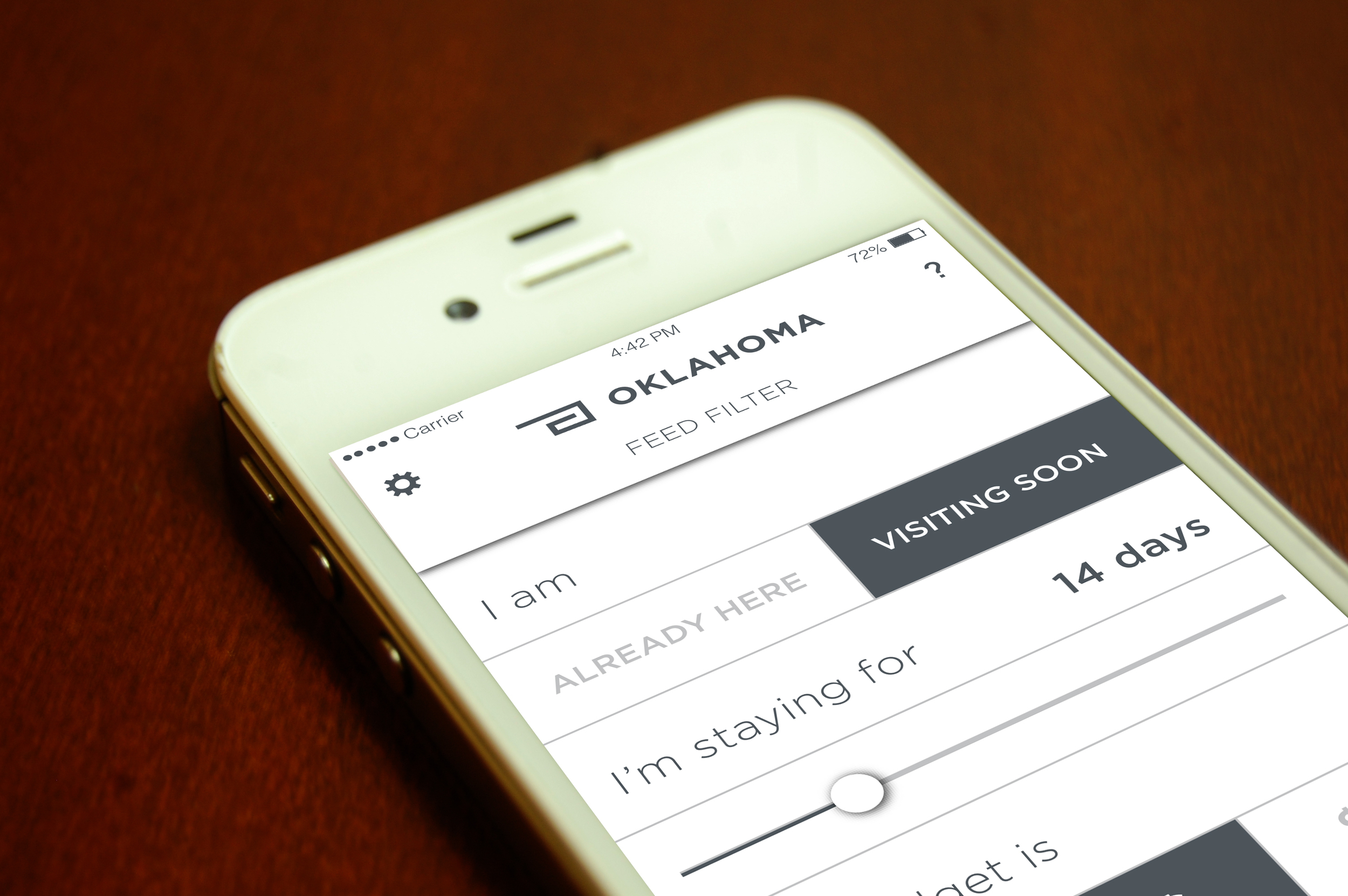
Rebranding is not always executed through revolutionary design; sometimes it is accomplished through evolutionary design. In this case study of rebranding Oklahoma tourism, I chose to work with an existing brand element to develop a more cohesive and modern identity. I also aimed to create a brand that was relevant to Oklahoma's visitors and residents. The starting point of the rebrand was the Travel OK logo. I saw an opportunity to create an icon system based on the logo's simplistic and geometric form. The icons then became tools to organize tourism destinations, events, and other content. This content organization was implemented in the website redesign as well as the mobile app. The web and mobile interfaces are designed with emphasis on imagery and clean typography. I also created a filter feature for users to customize the content seen within the interface. My goal was to make the user experience with Travel OK more interactive and personal.


TRAVEL OKLAHOMA
Promotional Campaign
Accompanying the Travel OK rebrand, I also developed a promotional campaign designed to inform and enlighten public audiences about Oklahoma tourism. The concept for the campaign was drawn from one of the state's most common associations, the Broadway musical Oklahoma!. I paired the musical's lyrics to modern day imagery to make new interpretations of the words' original meaning or references. Throughout this campaign I aimed to break any misconceptions that have been formed about Oklahoma through beautiful imagery. I wanted to present Oklahoma as a destination that has more to offer than casinos and sports games.


